
Thought Process
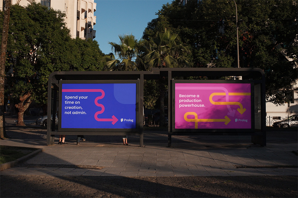
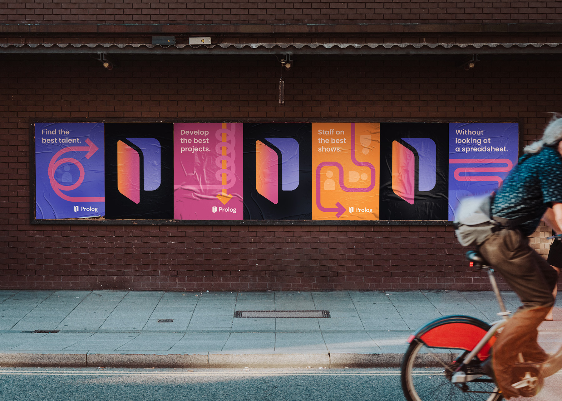
To stand out in a crowded market I utilized Prolog’s brand colors in a bold, minimalist way. These large fields of solid color demand attention in an ecosystem full of overwhelming detail. Abstracted visuals give a nod to the writing and staffing process without becoming overly literal. The use of the arrow suggests the journey of developing a scripted project while always ending up at the best solution, Prolog.

People Say
This work is so great. It's helped us nail down aspects of the brand we haven't been able to put into words.
– Jon Stahl
Co-owner, Prolog
Deliverables
Campaign design system
Out of home mockups
Social ad animations
Credits
Creative Direction: Ed Mann
Design: Ed Mann
Animation: Ed Mann